This project began with a trip to the beach and marine lake on a day forecast for hurricane whether, the purpose of this wasc sketch with gestural marks to allow emotion into the work.

A3 graphite and charcoal

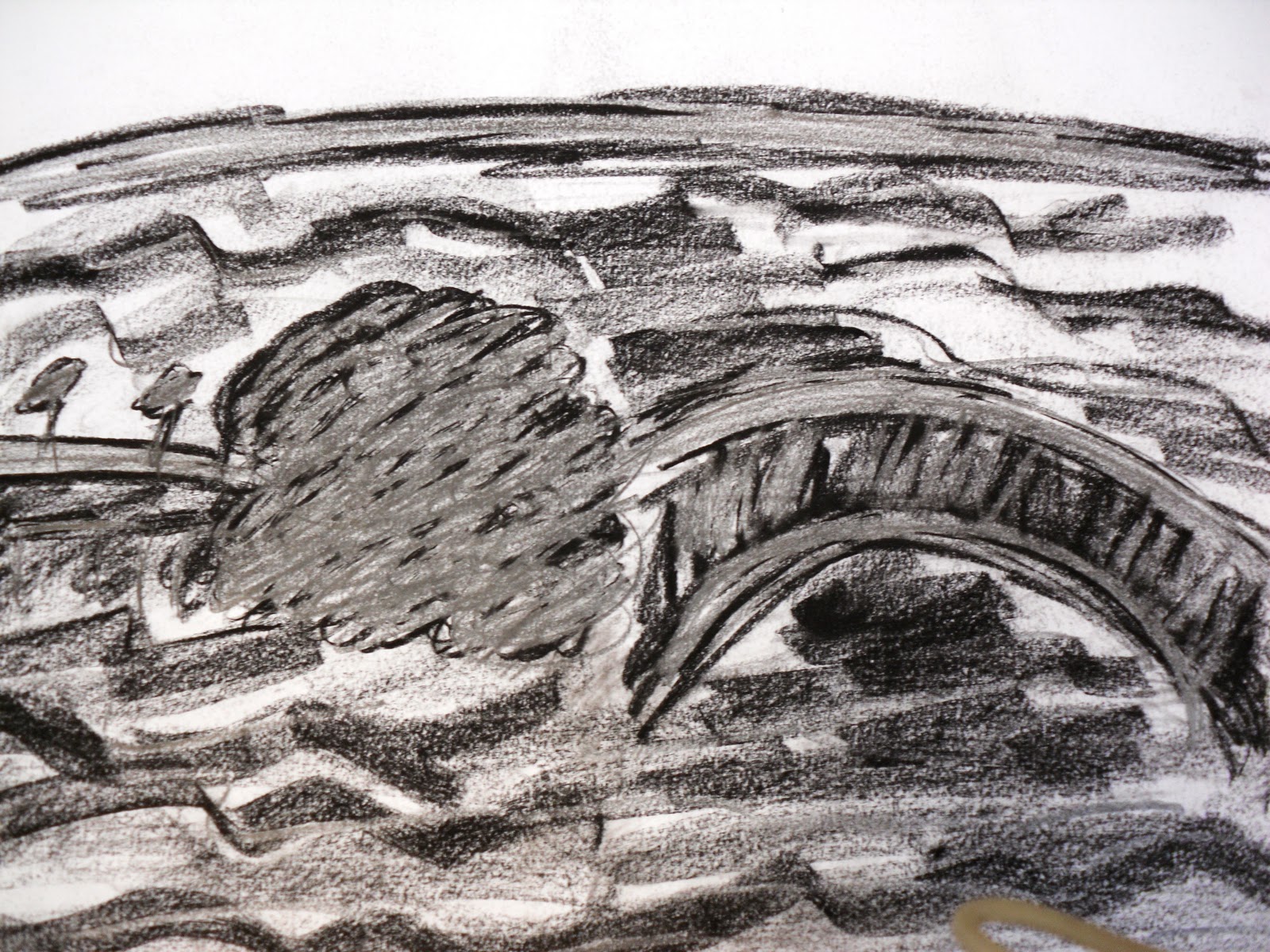
A3 compressed charcoal

A3 compressed charcoal

A3 compressed charcoal

A3 compressed charcoal

A3 compressed charcoal and chalk

A3 compressed charcoal

A3 compressed charcoal

A3 compressed charcoal
A3 compressed charcoal and graphite


A3 compressed charcoal

I've began to use paint, to relate to the artists i had been looking at including; Ivon Hitchens, Paul Nash and Peter Lanyon developing the sketches I produced from the beach and lake.

A3 paint

I've stuck to monochromatic colours although the artists do incorporate colour in their work, i want to keep a sinister appearance, this is a piece i reworked by darkening the skyline and lake with layers of diluted indian ink.

A3 paint and ink


A3 paint and ink


A1 Paint and ink


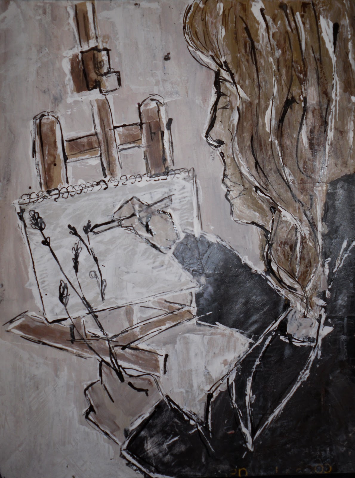
A6 pen and wash sketches, mimicking Joseph hermans technique.


A5(ish) greatly influenced by Nicola Hicks' brown paper and paint with image ontop, keeping John Virtue's sinisism and Joseph hermans mark making.


These more detailed images are not as strong as the following images with less detailed information, I have also drawn sections of the image, applied paint and emphisized the outline with a further layer of ink. This has created subtle undertones.