I am interested in applying to the interactive arts course because i feel i will do well and have a lot to offer on a course that is as versatile as this. I like that its is not restricted to any one area of art and design yet not quite so broad as a general art and design course. I have seen the facilities at the university and feel I will make good use of them.
Wednesday, 18 January 2012
2012 Current Project
The title of the brief is through the looking glass, and is a study of human form, for this project i wanted to look at soldiers and war, attacking the subject from multiple angles.

This is a piece of acetate with my ideas on, the reason for tieing the acetate into the book, is to coincide with the idea of through the looking glass.

This is a mind map of the areas of what i could look into and different issues I could address

Started with some research on both war artists and the idea of alter ego's to present the human form and personality.


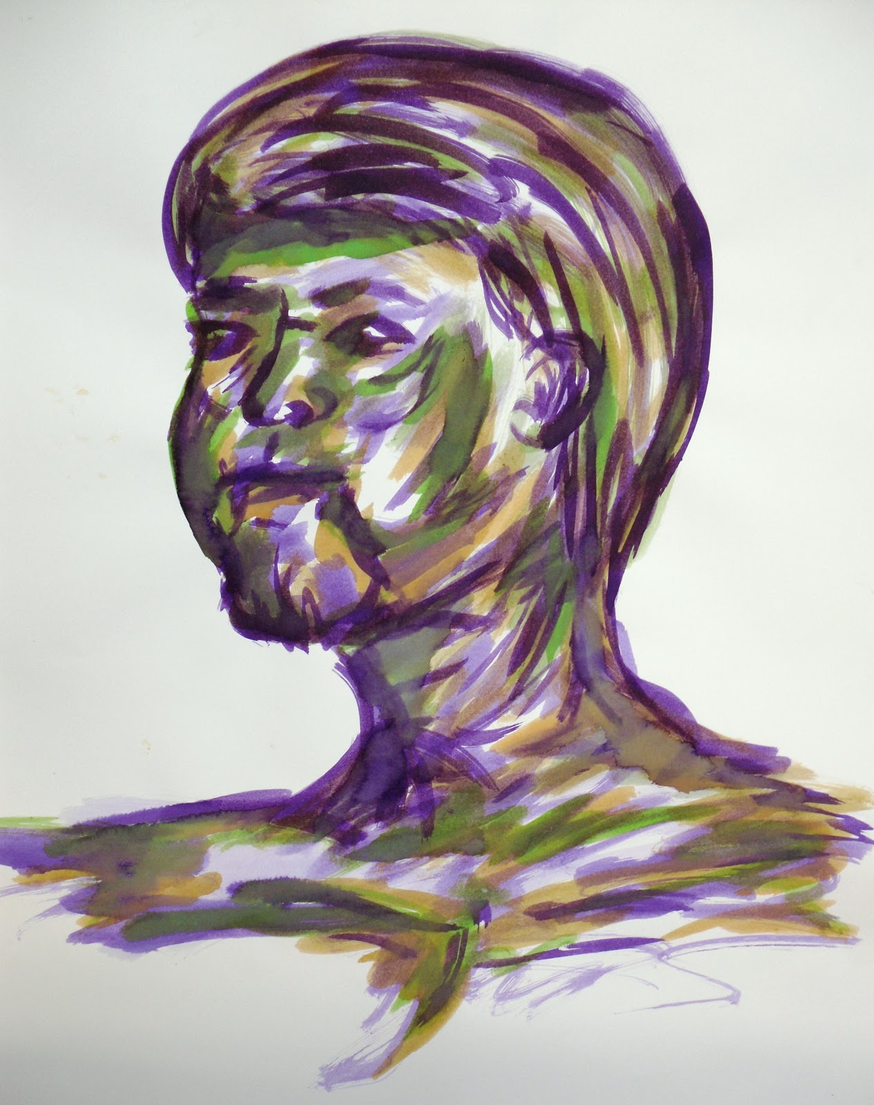
I've begun sketching from photographs of both images from websites, books and images of friends I have in the army.

I want to use different media, so in this selection of imagery I have used ink on emulsion, and wax paper with paint and ink.

The next set of images both use ink, but on different surfaces (brown paper and cartridge paper.

This is where i am currently in the project, This is the idea of through the looking glass, to see if the image you see alters with perception, soldiers can be seen as heroes or killers depending what side you see them from. Again i have used acetate as a means of creating the glass/mirror like effect.


I have started looking on the Imperial war museum website, to look into the other war artists such as Linda Kitson and Paul Nash, who's work is quick, sketchy and mostly monochromatic, which is the style i enjoy working with. Thier work will inspire my own technique to flurish further, and i plan to do drawings that are not as controlled as previous ones.


2011 Life Drawing
In the life drawing classes we ahve used multiple media to create the human form. Here are a select few.

Above is a 1 min sketch and below a 15 min sketch, both using the incorrect hand and graphite in a continuous line drawing.


This was a willow charcoal piece on brown paper, concentarting on using line to create tone using the correct hand.

Another charcoal drawing this time using compressed charcoal, again concentrating on tone.

Study on close up, so chose hands as I had struggled previously and wanted to improve, this is a continuous line drawing using the incorrect hand.


Again focusing on tone, using ink in a 10min period.

We were able to incorporate our own style and technique in these drawing, on the condition that we included some colour, as mark making is my most preferred elements of drawing, I produced pieces that were stong in this area, but also tried to include aspects of tone through the use of the the different shades and colours.

Pastel and ink
Ink

Pastel and ink
2011 Typography
This is a Typography and papercutting project, other than this title page, no other paper cutting experiments were successful.


A3 collage inspired by Marinetti's futuristic work. The idea was to use this style of working to create a background that would include different type faces, and have type on top.

A2 Example of collage background with different type faces using lyrics.

A3 example of the type layered on top, I chose lyrics that were based around music, as the final piece

A1 Final piece

Subscribe to:
Posts (Atom)